The color caramel is often perceived as a luscious embrace of warmth, akin to the gentle touch of sunlight filtering through autumn leaves. This hue, rich and inviting, reflects the complexity of human emotions—its multifaceted nature oscillates between comfort and elegance. As we delve into the essence of caramel, it becomes imperative to explore not only its visual characteristics but also the cultural and psychological connotations that accompany this delectable shade.
At its core, caramel is a golden-brown color, reminiscent of the sugary confection that tantalizes our taste buds. However, its appeal lies far beyond mere aesthetics; it conjures feelings of nostalgia and warmth. The visual spectrum of caramel spans various tones—from the light beige of a frothy latte to the deep, rich brown that evokes images of melted toffee drizzled over a decadent dessert. These variations highlight the versatility of the color, allowing it to adapt to various contexts while retaining its inherent comfort.
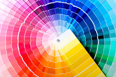
The allure of caramel is intimately tied to the warmer shades of the color wheel. This palette, characterized by reds, oranges, and yellows, envelops the observer in a cocoon of coziness; it invites sensations of familiarity and home. Shades such as amber, ochre, and apricot can be found woven into the fabric of caramel, enhancing its warmth and enriching its appeal. Each undertone serves as a brushstroke on the canvas of this color, creating a tapestry that resonates with both vibrancy and tranquility.
Moreover, the psychological implications of warm colors, particularly caramel, play a significant role in how this hue is perceived in various domains. Warm colors tend to elicit emotions related to joy, enthusiasm, and warmth. They often inspire feelings of connection and comfort, reminiscent of gatherings around a hearth or the joy of shared meals. Caramel, with its warm essence, embodies these sentiments, making it a popular choice in interiors and branding alike.
In design, caramel can evoke a sense of luxury and sophistication when utilized thoughtfully. Its earthy tones can ground a space, establishing a robust foundation, while simultaneously exuding elegance. When paired with cooler shades, such as slate gray or deep navy, caramel acts as a counterbalance, softening the starkness and weaving a harmonious narrative that speaks to both modernity and tradition. There exists a remarkable alchemy in the juxtaposition of warm and cool colors, one that showcases the unique charm of caramel.
Culturally, caramel enjoys a prominent presence across various mediums. In fashion, it lends an inviting warmth to ensembles, merging effortlessly with a plethora of shades—from bold jewel tones to muted pastels. Its adaptability allows it to be a perennial favorite, echoing the idea that comfort does not have to forsake style. One might envision an autumn wardrobe embellished with caramel-toned scarves, the fabric wrapping against the skin like a reassuring hug.
In the culinary world, caramel has transcended its primary identity as a flavor. It serves as a metaphor for the intricacies of life; just as the sugar transforms into a molten substance with careful application of heat, so too do our experiences evolve into the richness of wisdom. Caramel embodies delight and indulgence, capturing the essence of celebration and the sweetness of shared moments. This metaphorical resonance affords a deep connection to the color, making it not only a visual delight but also an emotional one.
In art, caramel has inspired countless artists, who explore its depths through varied mediums. Its tones evoke reflections of the natural world, reminiscent of autumn sunsets or the luscious hues of ripe, harvested fields. Artists utilize caramel to forge connections between the viewer and the visceral experience of nature, inviting contemplation of beauty found in simplicity and warmth. Through brushstrokes of caramel, a narrative unfolds that celebrates the ephemeral nature of life.
The unique appeal of caramel is also evident in its role as a facilitator of communication. In branding, it often signifies reliability and approachability, fostering trust and inviting consumer engagement. Many brands opt for caramel to convey a sense of warmth in their messaging, appealing to human sensibilities that gravitate towards comfort and familiarity. This strategic choice underscores the broader cultural implications that color can have in shaping perceptions and relationships.
In conclusion, the exploration of caramel extends beyond a mere inquiry into a color. It intertwines with themes of warmth, comfort, and complexity—a reflection of the human experience itself. As one navigates the spectrum of warm hues, caramel emerges as a beacon, offering solace and elegance. Its multifaceted nature, deeply rooted in both emotional resonance and aesthetic appeal, invites individuals to immerse themselves in its embrace. When we appreciate and understand the nuances of caramel, we not only engage with color but with the profound stories it tells about us and the world we inhabit.

Leave a comment