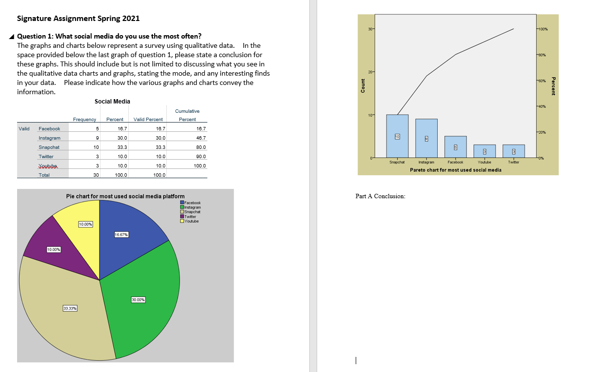
When confronted with graphs and charts, one might ponder: “What stories do these visualizations convey?” This question becomes increasingly compelling in academic and professional contexts, where data interpretation is paramount. However, gauging the conclusion that a chart supports can be rather intricate. This leads us to challenge ourselves: Can we unequivocally ascertain the narrative embedded within raw figures and plotted points? Herein lies the journey of interpreting graphs with erudition and assurance.
To embark upon this exploration, it is vital to first understand the core components of any graph or chart. Typically, one encounters axes, labels, legends, and data points that collectively construct the visual narrative. Yet, our task transcends mere identification; it demands an analytical lens through which to perceive the underlying dynamics at play.
Commencing with the x and y axes, one must scrutinize the scales employed. Are they linear or logarithmic? This choice alone influences the interpretation of trends. For instance, a linear scale may suggest a straightforward increase or decrease, while a logarithmic scale could indicate exponential growth or decay. Thus, recognizing the axis configuration is the first step towards a nuanced comprehension.
The subsequent layer of inquiry pertains to the labels accompanying the axes. Clarity in labeling is paramount; it delineates what exactly is being measured and contextualizes the data presented. A label such as “sales in thousands” versus merely “sales” could drastically alter one’s perception of the graph’s implications. Therefore, scrutinizing labels and their units is essential for accurately grasping the depiction.
Proceeding further, the legends that clarify distinctions among multiple datasets warrant attention. Charts often present comparative data, where different colors or patterns signify distinct entities or time periods. It is imperative to understand these differentiators to draw informed conclusions. For example, if a graph illustrates sales data across several years, the colors may represent different products or sectors. The interplay and competition among these can unveil critical insights regarding market dynamics.
Next, assessing the data points themselves requires a meticulous eye. One might observe trends, anomalies, and patterns that beckon deeper inquiry. An upward trajectory may represent growth or recovery, while a downward slope might suggest decline or stagnation. However, interpreting these movements demands careful consideration of the context. Are external factors influencing these trends? Could seasonality or economic shifts be at play? By contemplating these questions, one positions oneself to glean comprehensive insights.
In addition to examining trends, identifying correlations or the lack thereof is equally crucial. A scatter plot, for instance, may display a positive correlation between two variables, implying that as one increases, so does the other. Conversely, a lack of correlation might suggest independence. This exploration of relationships within the data can unveil underlying truths, thereby supporting or refuting hypotheses.
Moreover, embracing the element of uncertainty emerges as an essential aspect of data interpretation. Visualizations often convey confidence intervals, margins of error, or even potential outliers. Recognizing these uncertainties allows for a more tempered conclusion, one that acknowledges the variability inherent in datasets. Thus, while a graph may suggest a dominant trend, it is prudent to remember that data do not operate in a vacuum.
Equally important is the narrative aspect of graph interpretation. The graphs we encounter are not mere collections of data; they tell stories shaped by the decisions of their creators. Who designed the graph and for what audience? What biases or objectives may taint its representation? A critical perspective is paramount to approach any graphical interpretation with the discernment it warrants.
In educational contexts, one often encounters exercises to conclude narratives from given graphs. Here, pose a practical challenge: without prior knowledge of the dataset, can one draw a conclusion based solely on visual observation? This exercise not only gauges one’s analytical skills but also enhances one’s capacity to communicate results effectively. Strong conclusions derived from visual data depend as much on persuasive articulation as they do on factual accuracy.
Equipping oneself with the skill of graph interpretation enriches both academic and professional pursuits. Whether crafting a research paper or presenting to stakeholders, understanding how to deduce and convey meaningful conclusions is paramount. Thus, one must not shy away from engaging with graphs critically and creatively.
Lastly, it is beneficial to practice interpreting various types of graphs and charts. The diverse forms they take—from bar graphs to pie charts, and from line graphs to histograms—each presents unique challenges and opportunities for analysis. Regular exposure and practice amplify one’s confidence in drawing conclusions from diverse datasets.
Ultimately, the journey of interpreting graphs with confidence emerges not only as a skill but as an art form. It galvanizes the analytical mind, propelling one to uncover stories woven within data. The next time you engage with a chart, pause and ask yourself: “What conclusions can I draw from this?” You may find more than just numbers on a page; you might unearth insights that propel your understanding forward.

Leave a comment